Enhancing the Music Experience
Using UX/UI to redesign Shazam’s user flow for discovering songs and adding them to personal playlists in order to enhance the musical experience.

Team
Lauren Nipper
Allie Boyle
Miriam Silvas-Lopez
Ben Lague
Duration
3 weeks
Responsibilities
User Interviews
Affinity Mapping Synthesis
Feature Analysis
Site Map
Sketches
Wireframes
User Testing
Prototype
Tools
Figma
Trello
Zoom
Google Suite
Shazam, a music app that has developed one of the most iconic music discovery experiences since 2008. It's that magical app that identifies songs with a simple tap of a button.
Challenge
Since their launch, they have collected over 70 billion shazams and 225 million monthly users. However, in recent years, Shazam has faced a challenge with retaining its users due to the nature of its service. Users only return to shazam when they need to find an unknown song that’s playing again.
Solution
Our team believes by listening to our users needs, we can enhance Shazams platform to enrich their musical journey and provide them with meaningful content and exciting features that they want to continuously return to.

Introducing…
Research Objective
To gain comprehensive insights into Shazam users' behaviors, preferences, and expectations, with a specific focus on music discovery and post-discovery actions
What did our users teach us?
In order to build a strong base of understanding, we held interviews that focused on gathering insights on our users behaviors, preferences and expectations of the end to end music experience, starting from first discovery to final actions.
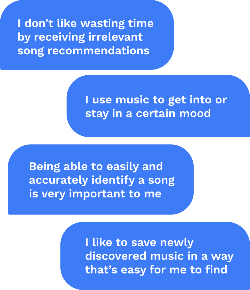
Through those interviews, insights that continued to pop out to us were that:
Ease and efficiency were of top concern.
Users were utilizing music to enhance their mood and daily activities
Users wanted a simple way to collect their music with not many steps
And they desired accuracy when trying to discover and acquire a songs information.
How do we compare?
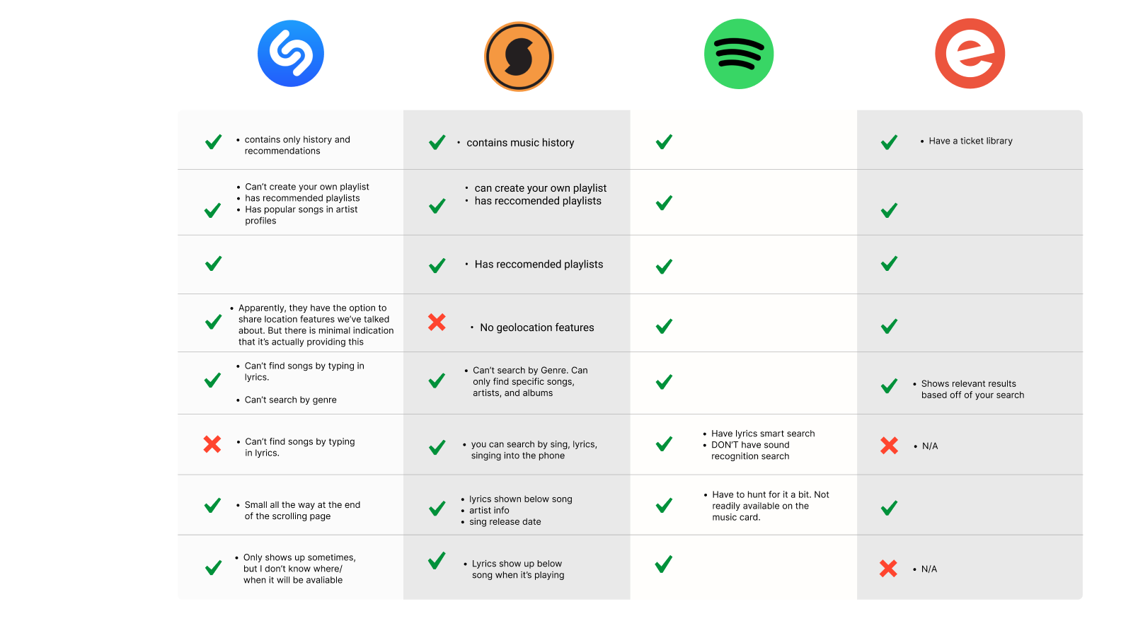
In my feature analysis, I fleshed out the similarities and differences in features between Shazam and other direct and indirect competitors in order to see how Shazam compares to other companies.
We can see that there are areas of growth within the realm of smart discovery for lyric and sound recognition.
Let’s get organized.

Users were having trouble navigating the app, so we felt the site map needed reorganizing with a change in Information Architecture.
Previously, getting lost in a maze within the app was normal. Now, navigating the app is seamless and intuitive.
We conducted 4 in-depth user interviews, engaging with users who have either used Shazam or some kind of music discovery tool. These interviews allowed us to unearth valuable qualitative data, understanding their motivations, pain points, and desires when it came to their music discovery and collection experience .
Which brings us to our persona, Grace, the groovy gourmet!
Meet our listener.

-
Grace balances work with social lifestyle. She often finds herself in new places being exposed to new music.
She makes enough money to often visit new places: travel, go shopping, concerts & festivals, eating out and enjoys music to enhance her life, but doesn’t have much knowledge on the topic.
-
Hates it when a song is recommended that is not aligned with my music tastes.
Annoyed when Shazam doesn’t identify the right song.
-
Wants personalized recommendations based off of current music taste or to discover new types of music.
Wants to discover local music and events based off of location.
Appreciates an intuitive design that makes it easy to find things and save time.
Problem Statement
Grace needs a way to seamlessly discover, organize, and access personalized songs to enhance their overall music discovery experience.
How might we…?
-
... create opportunities for a personalized experience?
-
... increase the accuracy of song identification?
-
... make accessing past Shazams easier?
-
... provide important song information to users?
Let’s see this journey.

To gain a better understanding of how Grace was experiencing Shazam, we created a journey map to take a look at some high and low points in her experience.
While the initial experience was positive, the rest of the journey had some frustrations surrounding ease of finding past Shazams and a lack of playlist abilities.
New flow for new vibes.

In this user flow we wanted to emphasize simple and easy to follow steps that have personalized and informative moments for Grace along the way while she discovers and saves a song. These aspects were at the top of her needs, therefore, important to us.
A sketching jam sesh.

To start our solution brainstorm, we held 2 different design studios to collectively sketch and weave our ideas together. Visualizing these solutions helped us start to wrap our heads around how our solutions would look. The design studio was incredible for our team because we all were able to combine our different outlooks of the same data.
We landed on final sketches for our home, music library, song card, playlist and map pages.
Our first pass.
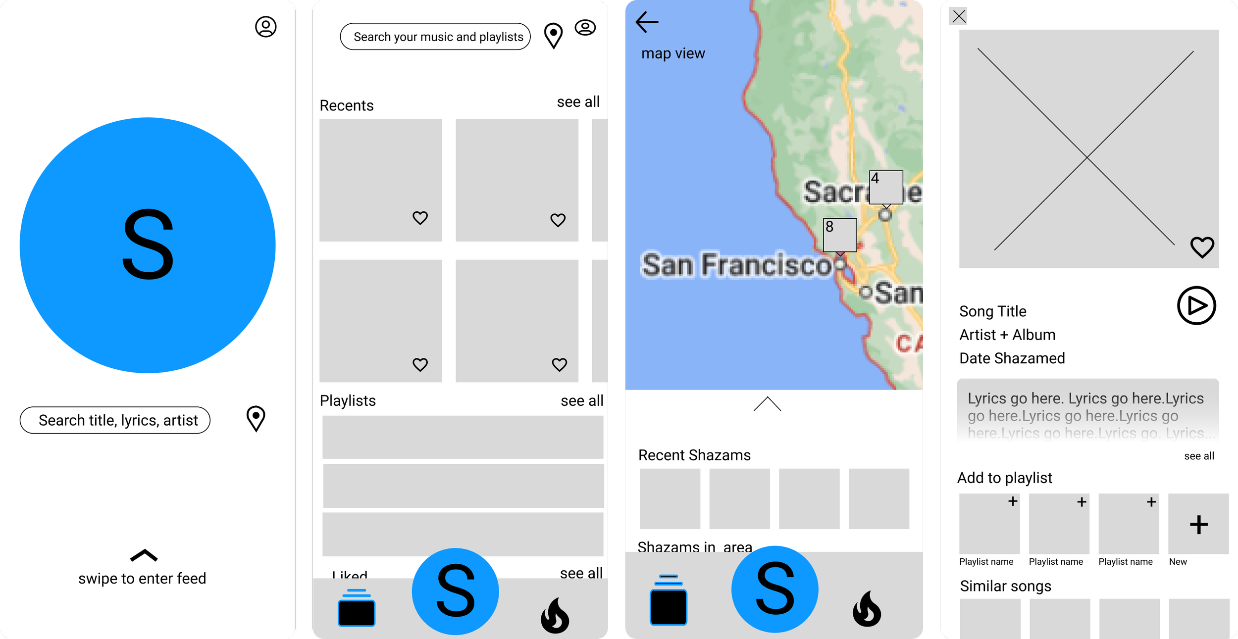
To bring those sketches to life, we created Mid-fidelity wireframes for each section of our flow. This includes:
Main Shazam page with search by lyrics/artist option and a geo-location icon to bring users to their Shazam map.
A music library of their collected music and past Shazams.
A map page that allows them to locate Shazams by location.
Song cards that include all the important information about a song.
Is it usable?
We performed a round of usability testing to check how user friendly our new app would be for someone like Grace. The task was to search for a past Shazam and listen to a recommended song based off of a past Shazam and here’s what I found:
100% were unclear on how to get from the main Shazam page to the feed and what to expect
75% were confused what the navigation bar icons meant
50% had difficulty finding Shazam history based off of a location search
100% were unclear about what map feature was showing them
75% were able to find a song in Golden Gate Park
75% were able to find a related playlist based on a song from past Shazam
Look good, feel good.
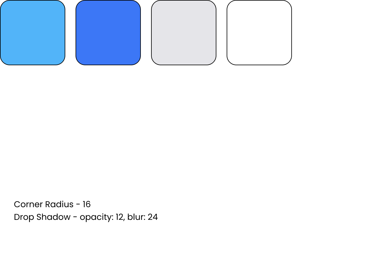
To provide consistency throughout the app, we locked down a style guide system. This became very important when we had 4 different people at once working on the high-fidelity wireframes.
Now, let's explore the culmination of our efforts – the high-fidelity prototype. Take a moment to navigate through it! It's essential to note that, given the sprint nature of this project, the prototype is not entirely built out. However, you'll find helpful blue hit boxes that indicate clickable areas.
Within this prototype, you can seamlessly browse your music library, review your previous Shazams, explore music and events on maps, and uncover recommended songs tailored to your personal preferences. Dive in and enjoy the experience!

Our big debut.
Up next.
Looking ahead, there are some things our team would love to do, time permitting.
Test how users customize and create their playlists, so we can make that process seamless and easy.
Provide mood-based playlists for quick listening options, since our users liked to utilize music to boost or maintain their moods.
Provide data settings that are easily accessible and adjusted to users’ preferences because our users wanted control and security around sharing their location data.