Turning a New Page
Redesigning the search, save and checkout flow for Green Apple Books’ website to digitally create the easy and comfortable in-store experience.

Duration
3 weeks
Team
Solo Project
Responsibilities
User Interviews
Research & Synthesis
Personas
Sketches
Wireframes
Prototype
Tools
Figma
Trello
Zoom
Google Workspace

Allow me to introduce…
Green Apple Books, a favorite local bookstore in San Francisco since 1967. It is a gem of San Francisco that allows its readers to relish in the physical joys of buying books. As their motto reads, “Real books, real people, and real local”.
Challenge
Currently, Users have been having challenges navigating the website, leaving them feeling discouraged. For many reasons, people turn to Green Apple Books’ online shop to support their favorite local business because in-person isn’t going to always be accessible.
Solution
As the lead UX Designer, I took the friendly, inviting and helpful experience in-store and translated it to their online shop in order to better the book search and purchase experience for users.
Goal
By improving user flows and information architecture of the site, Green Apple Books will be able to expand their customer base, leaving them fulfilled and looking forward to return time and time again.
Research Objective
To identify pain points and needs that users experience during the online book search and purchase process.
Let’s get organized.

To gain a better understanding of how users expected to see products and information grouped on the site, I conducted an open card sort and found that some categories were missing in the current navigation, like searching by genre, format and reviews.
With this information, I had a foundation of how users think and could prioritize certain categories based on my user interview insights.
What about accessibility?
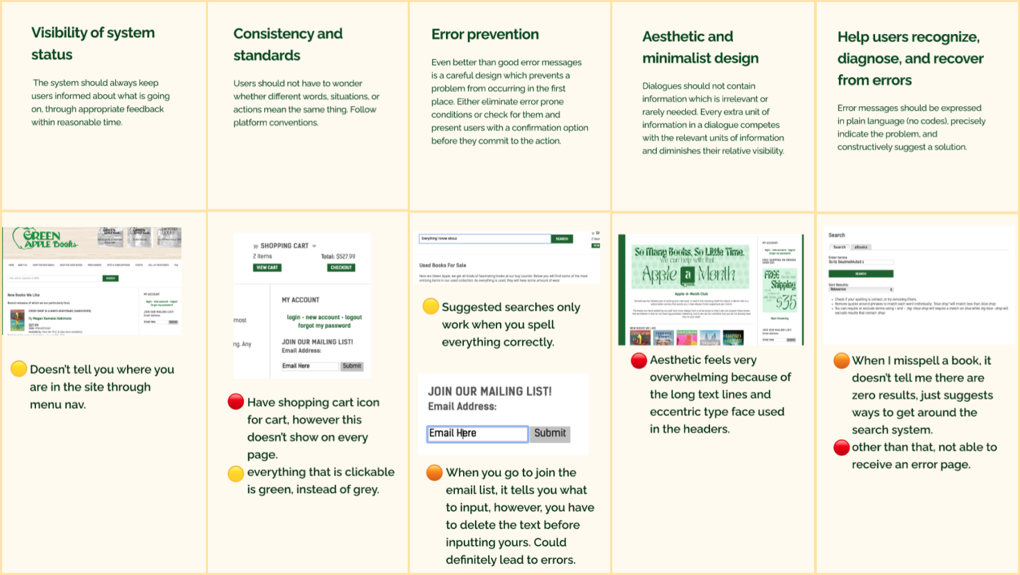
To further my site research, I conducted a Heuristic Evaluation to check accessibility of the site. There were some things that Green Apple Books was already doing a wonderful job at like, clear language that is used throughout the site, visibility and help sections.
However, I did find that there were some things that might cause some confusion and frustration with users, including:
The cart is not visible on every page
The busy aesthetic and typefaces that are difficult to read
A search engine that doesn’t allow for spelling errors
These are things that impact the range of people that can visit their site.
Can we C&C?

In my feature analysis, I fleshed out the similarities and differences in features between Green Apple books and other direct and indirect competitors.
We can see that there are areas of growth within the recommendation, filtering, review, and product visibility realms.
What does this journey look like?

Keeping my research in mind, this is what the current journey map looks like for users:
They are happy that there are featured sections
However, there are pain points around filters to locate different types of books and having no reviews.
Overall, the general trend has lots of ups and downs, rather than a steady incline.
Meet our bookworm.
I conducted 4 in-depth user interviews, engaging with Green Apple Books' loyal customer base. These interviews allowed us to unearth valuable qualitative data, understanding their motivations, pain points, and desires when it came to their online book-buying experience.
Which brings us to our persona, Emily, the book enthusiast!
-
Emily is an avid reader and lifelong learner. Her job and social catch-ups keep her busy, but she enjoys exploring niche books and literary genres in her free time. Emily's passion for reading fuels her desire to discover and own unique books that broaden her horizons.
-
Emily is frustrated when book descriptions lack detail or omit essential information.
Complicated checkout processes deter Emily from completing her purchase.
Emily has a hard time quickly finding books tailored to her specific interests.
-
Access to credible and relevant book reviews.
Quickly make her selections and complete her purchase.
Share her reading list with friends and fellow book enthusiasts.
Feel confident about her purchase and know what to expect upon delivery.

Problem Statement
Emily is a busy bookworm who needs an efficient, user-friendly and personalized way to buy books online, so she can continue to learn and build her unique literary collection.

A new flow.
In this user flow I wanted to emphasize simple and easy to follow steps that have personalized and informative moments for Emily along the way while she buys a book.
Quick sketching.
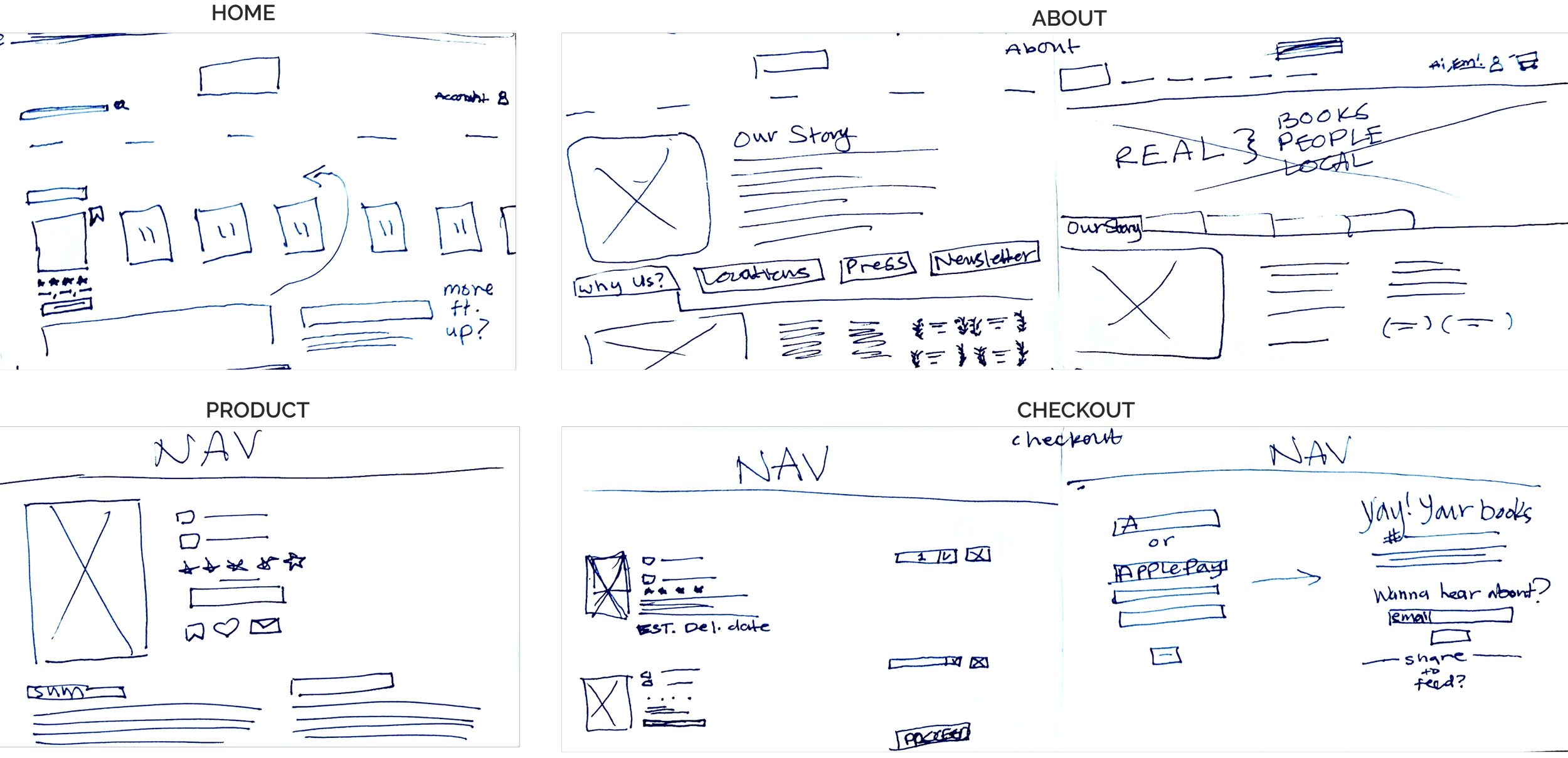
While sketching my solutions, I kept the layout clear and open. Here, we are looking at initial sketches for the

Building Mid-fi.
My initial wireframes allowed me to bring those sketches to life and start experimenting with the ways I could show as much info as possible, without it being overwhelming.
This first run included:
Personalized recommendations on each page, so Emily never misses out on a book she might like.
A filtering menu for Emily, so she can have a direct way to openly browse within her favorite sub-genres and easily specify the specs of what she’s looking for.
Specific delivery selections on the product page with corresponding details as needed, so she is well-informed.
Reviews on each book and overall rating, so she can feel confident in her choices.
An option for express checkout to keep this part of the process swift and familiar.
Is it usable?
I performed a round of usability testing with the task of searching for and buying a book and here’s what I found:
On the cart page when my users were checking out, the edit button wasn’t incredibly clear and intuitive
100% of my users were able to successfully complete the task
100% of users enjoyed the save to bookshelf and personal recommendations features.
60% of users didn’t want to rely on the filtering option to locate their desired book.
Changes made.

To fix the edit button confusion, I shrunk it down and moved it next to the items that can be edited, so users where more clear on its purpose.

Final product.
This brings us to our final product, the high fidelity prototype. Please feel free to click through it! Keep in mind, as this was a sprint, the prototype is not fully built out, but there are blue hit boxes that appear when you click on the screen to let you know where you can interact.
In this prototype, you can learn more about Green Apple Books, browse newly released books, save them to your virtual bookshelf for later, write a review for the book, “Daughter”, add it to cart and check out. Enjoy!
Next time.

Looking ahead, I would:
Create a mobile version, as our main user is on the go and would utilize a mobile version.
Experiment with hover states to give extra indication if something is clickable because it wasn’t entirely clear when you could click on titles as a ‘see all’ option.